Bedroom Color Combination: How to Build a Palette That Works With Your Floor and Light
This post contains affiliate links. If you buy through them, I may earn a small commission — at no extra cost to you. I only recommend products I’d genuinely specify as an architect.
A bedroom color combination that looked coherent on the mood board and wrong on the wall is one of the most common decorating experiences people describe — and almost always preventable.
And sometimes, all elements on the moodboard work well with the paint color of the bedroom. But later, when everything is in the room, somehow it feels off.
The problem is rarely the colors themselves. It is that they were chosen away from the floor, away from the light, and away from the room they were supposed to live in. This guide builds a bedroom color combination based on a differenc concept, you usually hear.
The usual order or “the right order” for choosing color is this: floor first, then walls and ceiling, then everything else (furniture) as the second color. And last, textiles.
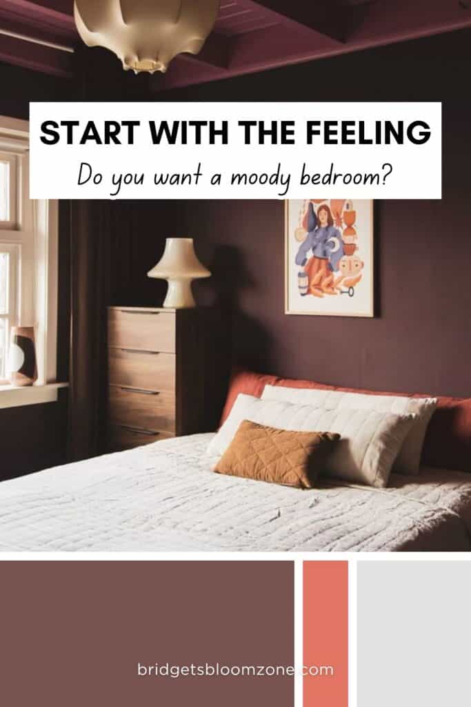
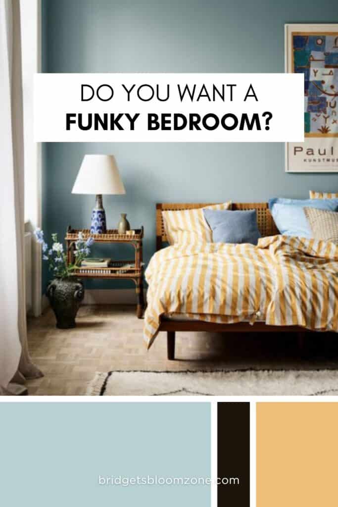
But before that, there is one very important step, that I see everyone is skipping: imagining or choosing a vision, a feeling, that someone wants to create in that specific room.
Once you can define the feeling, it is much easier to pair colors to that.
I have a quite long article about how to create a vision, or what do I mean by that, you can check it out before reading this. But now, I would like to write only about the color combinations of the bedroom. I think there are some combinations, that can be used safely.
How Does a Bedroom Color Combination Actually Work?
A bedroom color combination is a relationship between surfaces that share the same room — which means it is also a relationship with the floor, the light source, and the ceiling.
Before choosing any color, three variables determine what will work: tone, temperature, and undertone.
The 4 characteristics of a color, and other common terms
Hue: This is the most basic definition of a color. The name of the color family itself (like red, blue, green, yellow). It represents the specific wavelength of light, generally arranged around a color wheel.
Value (Lightness/Brightness): This refers to the lightness or darkness of a color. A color with high value is closer to white (a “tint”), while a color with low value is closer to black (a “shade”).
Intensity (Saturation/Chroma): This defines the purity, vividness, or saturation of a color. A high-intensity color is vivid and rich, whereas a low-intensity color is dull, muted, or closer to gray.
Temperature (or Undertone): This describes the psychological and visual “warmth” or “coolness” of a color. Blue is cool, yellow is warm, usually.
There are other important terms that define harmony, not just one color itself. These terms refine the perception of color, or describe how a color was modified.
- Tint is a sub group under intensity or saturation, and it means the pure color is mixed with white. It is lighter, but also lost some of its vividness.
- Shade is the opposite of tint – the color is mixed with black. It makes the color deeper, but also looses some vividness
- Tone means also, when the pure color is mixed with gray (or both black and white). It becomes softer or more muted, but it keeps the same hue while becoming less saturated. With other words, adding gray to a pure color softens it without changing its hue.
My favorite analogy for choosing color that match together is the seasonal color analysis for people. All colors from one season work perfectly together, and quite well from the colors of the sister-season next to it.
How can this information help us?
It is an easy compass. Once you get the concept, and chose colors based on a rule you choose, the result will be harmonious.
If you choose colors with similar characteristics — for example soft, warm colors with the same intensity — the result will feel more harmonious and closer to monochromatic.
If you want to create contrast, it is often easier and safer to change only one characteristic while keeping the others consistent.
Undertone is the variable most likely to cause color regret — not the hue itself. Two colors that clash on the wall almost always share competing undertones rather than simply being the wrong combination. The fix is to identify the undertone of each color before buying, and to check both against the floor undertone in actual room light.
The 60-30-10 rule in a small bedroom
The 60-30-10 rule divides a bedroom palette into three zones:
- 60% dominant (walls and ceiling, bedding)
- 30% secondary (floor and main objects — bedding, rug)
- 10% accent (small objects, one ceramic, a single cushion, art on the wall).
In a small bedroom, the 60% zone matters most. It sets the room’s emotional register — the feeling the room has when you wake up. The 10% accent is the lowest-stakes decision in the palette and can be changed easily.
In small bedrooms, the bed occupies more space than the floor itself. Although probably when you chose paint colors, usually the floor is there already. So I assume, you have chosen a paint color that matches your floor, and you can chose other things that fit to both.
Walls and ceiling together form the dominant zone — they should be treated as one surface, not two.
The Most Reliable Bedroom Color Schemes for Small Rooms
Reliable bedroom color schemes are not the most exciting ones. They are the ones that hold across morning, afternoon, and evening light — and that you still like three years after you chose them.
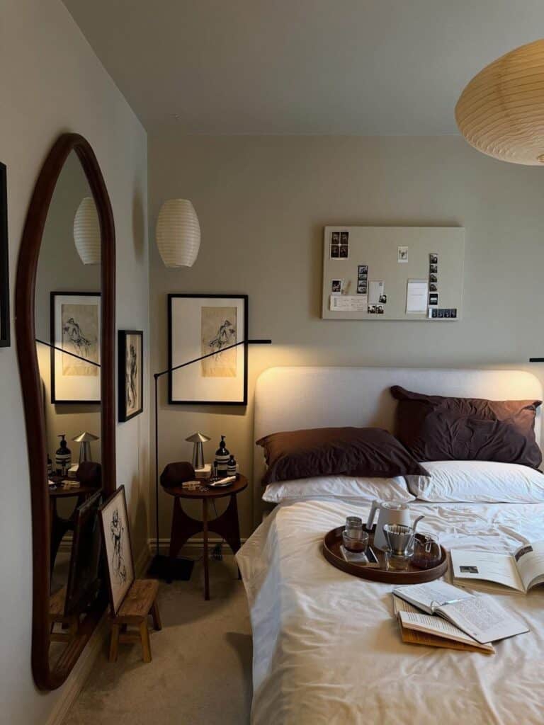
Warm neutrals and deep tone pairings
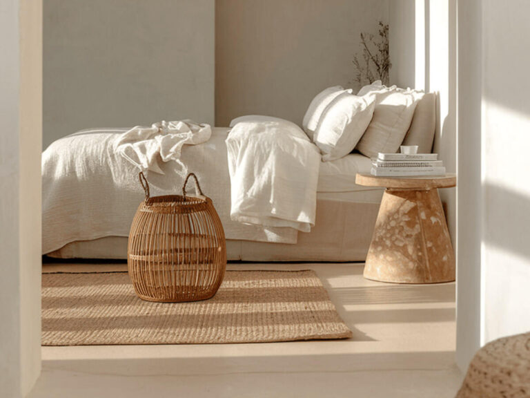
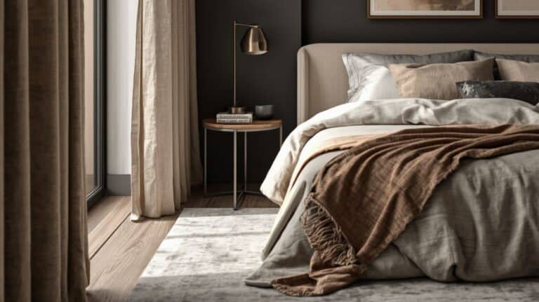
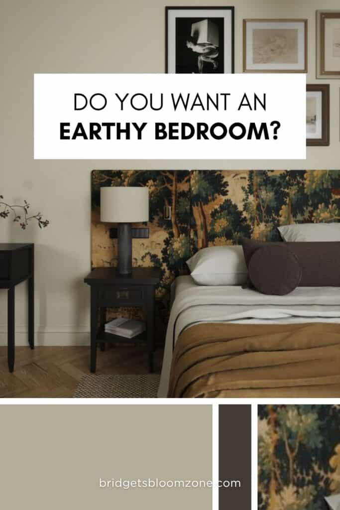
Warm neutrals with a clear clay or plaster reference — not generic beige — absorb light in a way that reads differently at each hour of the day. They are the most stable base for a small bedroom palette.
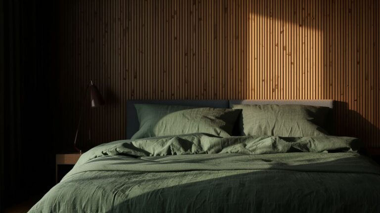
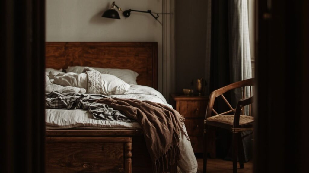
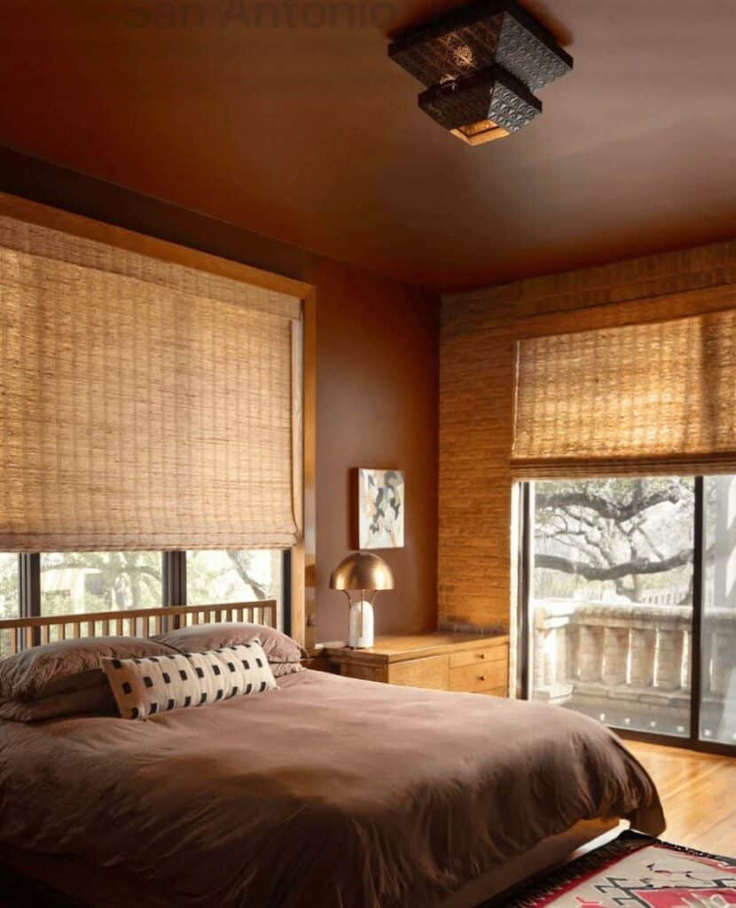
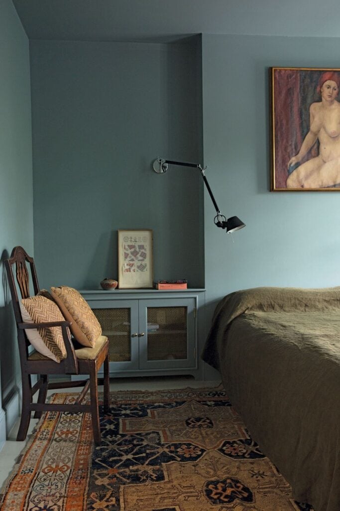
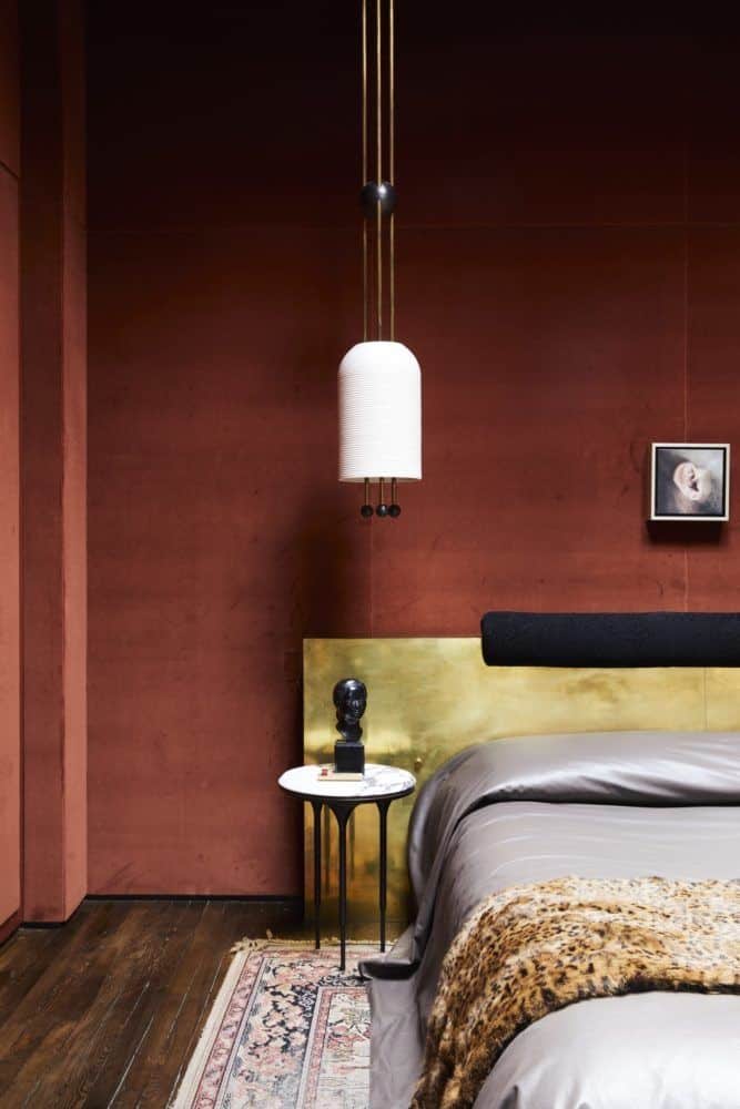
A deep tone wall — terracotta, dark olive, taupe — paired with warm natural materials (oak, raw linen, unglazed ceramic) is one of the most enduring approaches. The depth of the wall makes natural textures visible. The natural materials keep the deep tone from feeling heavy.
Your bedroom is small – a common misconception is, small bedrooms must be bright and light. But deeper tones work well surprisingly good. The key is not to choose too dark, and to paint the ceiling as well.
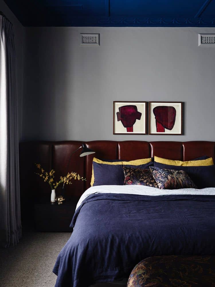
Accent walls can work well with deeper colors. Apply the deepest tone to one wall — typically the head-of-bed wall — and keep the other three and the ceiling in a lighter version of the same palette. For how earthy palettes work with deep tones, the earthy bedroom guide covers the full approach.
An other surprisingly interesting choice is to paint the ceiling darker. In some cases it works also amazing. Except attic rooms, but they are a special case, you will find info about them later.
Monochrome bedroom color schemes
Monochrome bedroom color schemes — one color carried across walls, ceiling, and possibly trim — are among the most spatially effective choices in a small room.
A single mid-tone applied continuously removes every horizontal line. The room reads as one volume rather than a stack of surfaces. In a room where ceiling height is already marginal, this approach consistently makes the space feel taller.
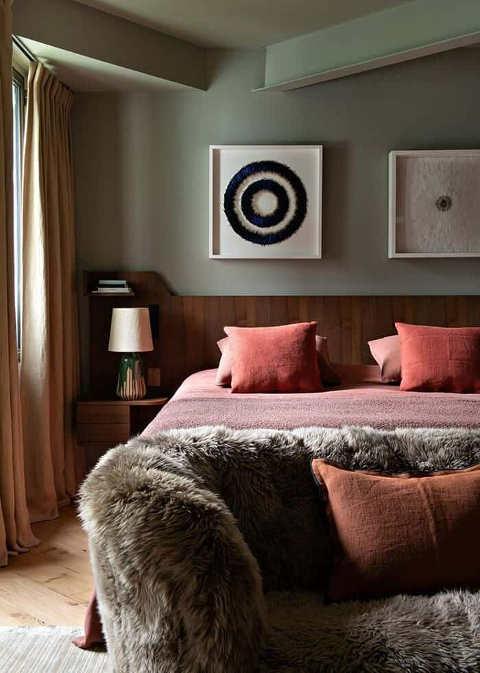
A two color combination for bedroom walls also works when both colors come from the same hue family at different values — a mid-sage on one wall and pale sage on the other three creates depth without competition.
What Bedroom Colors Make a Small Room Feel Larger?
Bedroom colors make a room feel larger not by being light — but by removing the visual interruptions that make it feel divided.
The most significant interruption in most small bedrooms: the horizontal line where a colored wall meets a white ceiling.
Continuous tone: wall and ceiling in one color
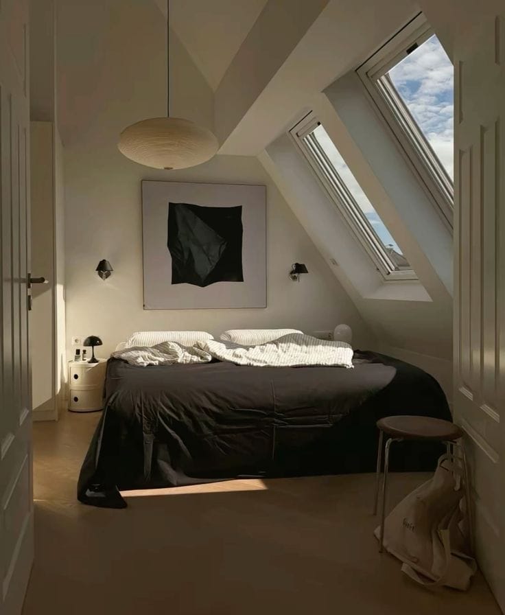
Carrying one color continuously from wall to ceiling removes every horizontal break. The eye reads the room as a single volume. This approach works best with mid-toned warm colors — sage, warm clay, dusty mushroom. Very dark colors carried to the ceiling can produce an intentional cocooning effect, but should be tested carefully in rooms under 12 square meters.
The spatial perception gain from matching wall and ceiling color is measurably greater in small rooms than in large ones, because small rooms have proportionally more ceiling relative to wall area.
And the best approach for attic bedrooms. The consistency of color makes the harsh angles disappear.
The bedroom ideas for small rooms guide covers how ceiling color fits into the broader small bedroom decision sequence.
When contrast works and when it doesn’t
A bold accent wall on the head-of-bed wall — while other walls stay pale — creates perceived depth. The contrast recedes away from the viewer, adding length. Contrast that wraps around the viewer reduces the sense of space.
The conventional advice to use white ceilings is often applied in the wrong direction. A white ceiling in a room with colored walls doesn’t raise the ceiling — it creates a hard horizontal line that draws the eye to exactly the height you want it to ignore. For how a single accent treatment changes the room, I will write a post soon about accent walls, covering when a second color earns its place on the wall.
Room Color Ideas: Introducing a Second Color Without Repainting
The second color does not need to be on a wall to be visible. Textiles carry color at a scale that changes the room’s palette as significantly as paint — and can be changed or removed at any point.
Textiles as the low-commitment second color
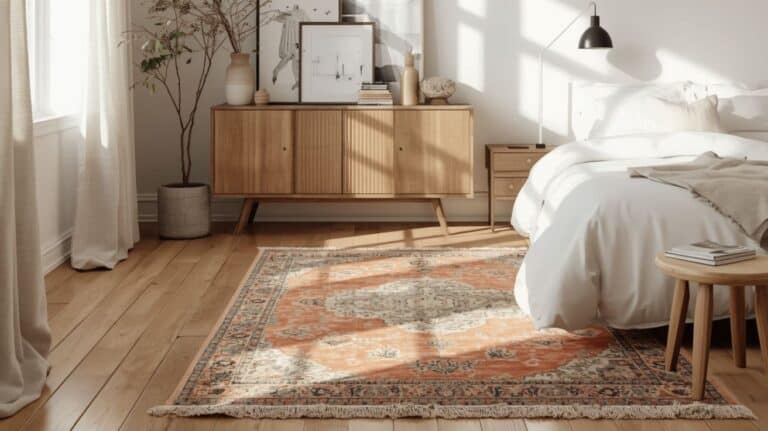
A single textile in the second color — a throw at the foot of the bed, a cushion, a rug with a warm accent tone — introduces a second note into the palette without a brush in sight.
One piece in the second color, placed at the largest surface visible from the doorway. Two or three pieces in the same second color compete with the wall color. One is a decision; three is noise.
For how textiles relate to the broader palette approach, the small room design guide covers texture and color together as the second layer of a small space.
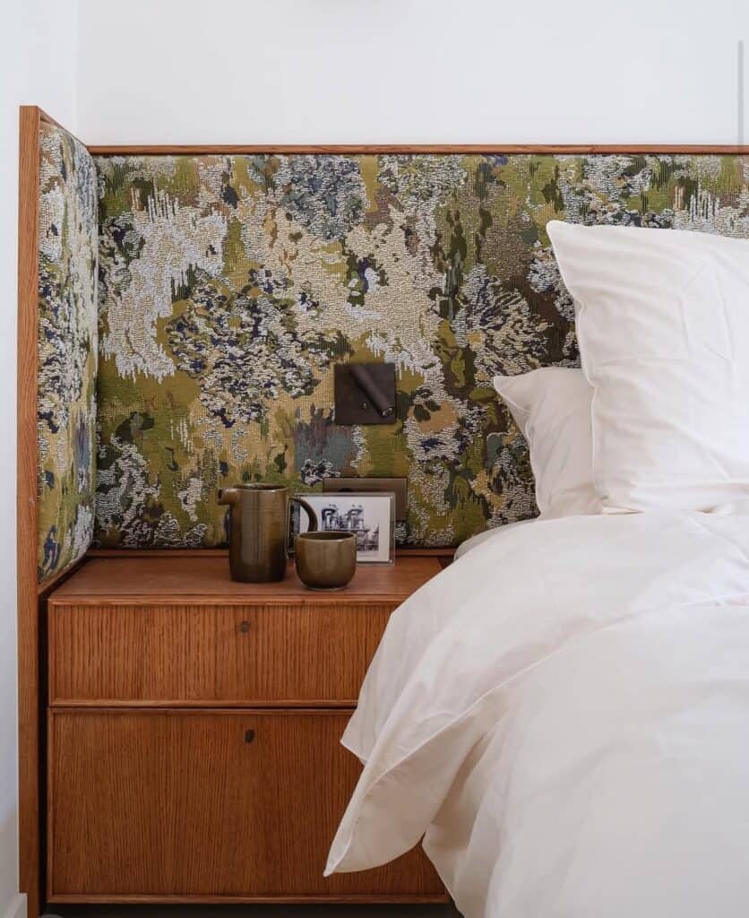
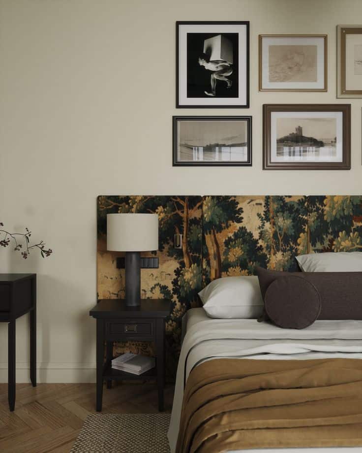
The headboard as a palette note
An upholstered headboard in a tone slightly deeper or warmer than the wall color functions as an accent without introducing a contrasting palette note.
A warm linen headboard on a pale plaster wall is technically one color — but the texture and mass make it read as an accent. The room feels considered without a second color appearing anywhere. For the headboard alongside other accent wall options, the accent wall bedroom post covers fabric panels, paint, and paneling together.
How Do You Test a Bedroom Color Combination Before Committing?
Testing a bedroom color combination properly takes longer than most people expect — and the most common shortcut is the one that produces the most regret.
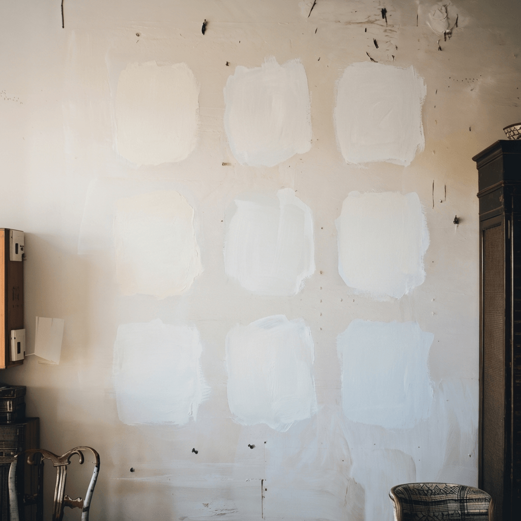
The large sample — why the swatch card misleads
A swatch card is a 5cm square of color viewed in shop lighting against white paper. It shares almost nothing with a 3m by 2.5m wall viewed in bedroom light against a wooden floor.
The fix: paint a large gypsum board with at least two coats of the actual paint. Tape it to the wall and leave it for two days — observe it in morning light, afternoon light, and evening under your actual lamps.
I once bought bathroom paint matched only against a grout sample in the shop, without doing this… It worked — but I had a trained eye for undertone in variable light. For everyone else, the large sample on the wall with the floor material propped at the base is the process that protects against regret.
The grout color guide shows how the same principle applies to tile — color in context, on the actual surface, in actual light, is the only reliable test.
Three light conditions to observe
The same paint color looks like three different colors across a day.
- Morning, natural light: reveals cool undertones that the swatch card never showed in north-facing rooms
- Afternoon, direct or overcast: the color at its most saturated, or its most flat
- Evening, artificial light: the condition the bedroom is most often used in — and the one most likely to be skipped in testing. The choice of the light source makes a huge difference.
Place a piece of the actual floor material on the floor directly below the painted sample. Stand at the doorway and look at both at once. The floor undertone and the wall undertone will either settle together or fight each other. No amount of looking at the wall sample alone reveals this relationship.
Final Thoughts
Start with the floor undertone. It anchors the palette — every other decision responds to it.
Treat walls and ceiling as one surface. Carrying the wall color to the ceiling removes the horizontal line that makes small bedrooms feel divided. No furniture decision matches the spatial improvement this single step produces.
Introduce the second color through textiles first. A throw or a rug is reversible. Still cheaper than buying a new bed. before committing to paint.
Frequently Asked Questions About Bedroom Color Combination
What is the best bedroom color combination for a small room?
A monochrome or near-monochrome palette — one mid-tone carried across walls and ceiling — consistently produces the best spatial result. The color itself matters less than whether the undertone matches the floor and whether the palette reads continuously rather than in competing sections.
Should bedroom walls and ceiling be the same color?
In a small bedroom, yes — or as close as possible. Carrying the wall color to the ceiling removes the horizontal line that makes small rooms feel low and divided. In rooms with slanted ceilings, a warm shade of white that complements the wall is usually better than an exact match.
How do I choose bedroom colors that do not clash?
Check undertone first. Two colors that clash on the wall almost always share competing undertones. Lay both samples on the actual floor in actual room light and look at them together before buying.
What two-color combination works best for a bedroom?
The same hue at two different values — a mid-tone on one wall and a pale version on the other three. This creates depth without visual competition and keeps the undertone consistent, so both colors shift together under changing light.
How do I test a bedroom color combination?
Paint a large gypsum board with at least two coats of the actual paint. Tape it to the wall next to the floor material and observe it over two full days in morning, afternoon, and evening light. Do not rely on swatch cards or phone screens.
What colors make a small bedroom feel bigger?
Colors applied continuously — wall and ceiling in the same tone — do more for spatial perception than any particular hue. In north-facing or low-light rooms, a mid-tone with a warm undertone often reads better than pale tones that go flat and cold.