Mid Century Modern Office: 4 Real Rooms Worth Copying on a Budget
This post contains affiliate links. If you buy through them, I may earn a small commission — at no extra cost to you. I only recommend products I’d genuinely specify as an architect.
Nobody was building a mid century modern office in 1955, because nobody had heard the phrase.
The style got its name almost thirty years after it was made. A writer called Cara Greenberg published a book about postwar furniture in 1984, and the title she and her editor picked gave an unnamed look a label that stuck.
Her book was mostly about two companies. Herman Miller and Knoll, both of which made office furniture.
So the style now being copied into spare rooms and living rooms was designed for workplaces first. That is worth knowing before you buy anything.
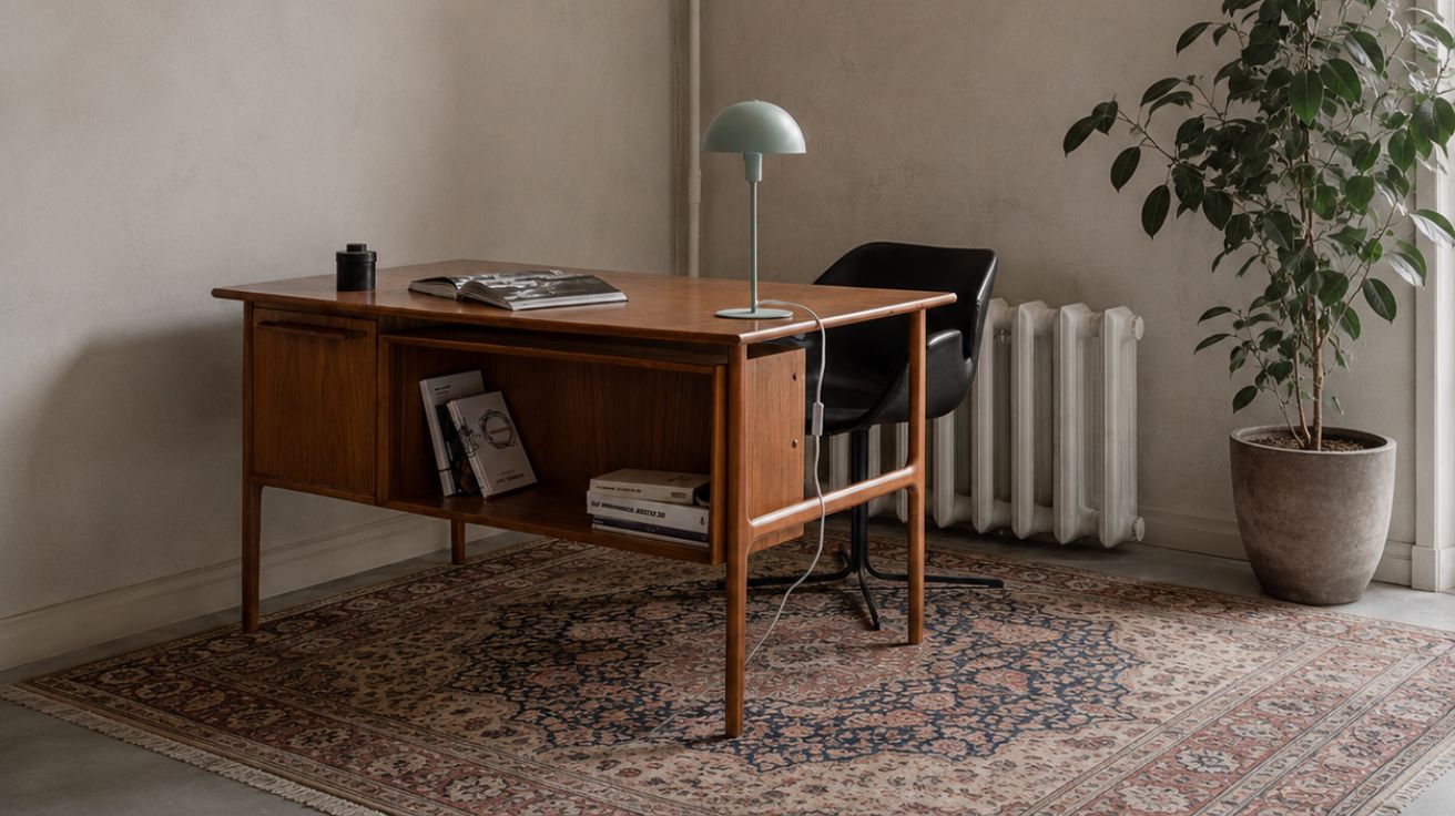
The objects survived. The way we use the space did not.
The revival came in waves after the book. Collectors through the nineties, then the reissues, then Mad Men in 2007, which is the version most people are actually picturing.
That television office is a fair reference and a narrow one. This post starts there, then sets three real rooms beside it, all built by architects for their own use and all smaller than you expect.
What Don Draper’s Office Gets Right
The show is not where this style came from, but it is where most people met it. That makes it the right place to start, as long as you know what you are looking at.
The set is a genuinely accurate record
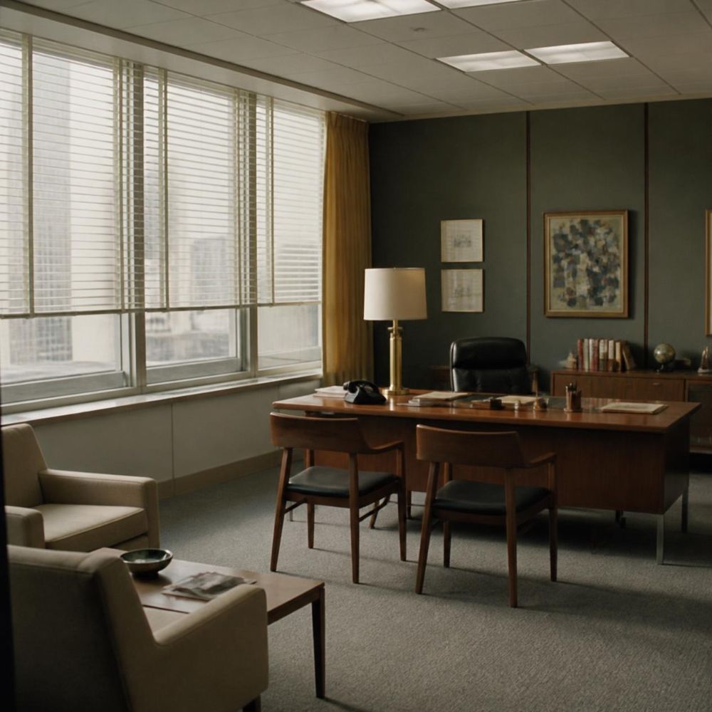
The production team dressed those rooms from period sources rather than a design textbook. The paneling in Draper’s office was real walnut, warmed with a red stain. The natural tone read as cold on camera.
That care is why the show pushed a collectors’ style into the mainstream. It also makes the room a usable reference for materials, proportion and restraint, which is more than most Pinterest boards offer.
The storage tells you the actual rule
Look at what holds things in that office. A credenza, a cabinet, a bar unit, and one object left out on a surface.
There is almost no open shelving anywhere in it. Everything that gets used daily lives behind a door, which is the single most transferable idea in the whole aesthetic.
The one thing worth changing
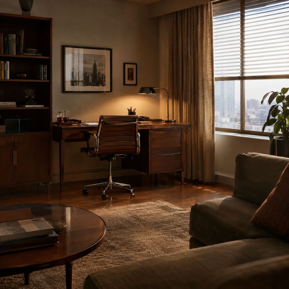
The office had a city below it, and that view was part of the fantasy. At home the evidence points the other way.
Researchers gave 150 students a dull attention task, then a forty-second break looking at a rooftop. Half saw a flowering green roof and half saw bare concrete. The green group made significantly fewer errors afterward.
Field experiments in real offices point the same way. Adding plants to a stripped-back workspace raised productivity by around 15 percent.
Alvar Aalto’s House: An Office That Opened Off the Living Room
Aino and Alvar Aalto finished their house in Helsinki in 1936. They designed it as a family home and an architecture practice at once.
You can read both functions from the street. The studio wing is white-painted brick and the living wing is dark-stained timber. The office stayed there until 1955.
Unfortunately I can not use images as they are copyright, but you can get a vibe looking at this video, featuring the museums official images. I recommend visiting the house if you happen to visit Helsinki!
What I noticed standing in it
It was built as a large house and it feels small today. That was the first surprise.
There is very little furniture by current standards, and everything has a place. The rooms are not crowded, and they are not as airy as a new apartment either.
It reads as a compact home with a few extras, built for a different set of objects. Our screens and chargers would not slot in without changes, though the plan is flexible enough to take them.
Light and plants do most of the work. The windows are enormous, and the garden effectively becomes part of the interior.
The desks were organized around the windows
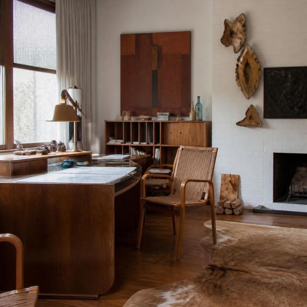
The studio held a surprising number of people in a modest floor area. Storage was compact, the tables were compact, and the daylight was distributed evenly rather than pooled in one corner.
The drawing tables sat around the windows. Nobody faced a blank wall, and nobody sat in the middle of the room.
Upstairs there is a detail the photographs rarely show. The small bedrooms have little writing desks at the windows, some built into the sill and some pushed against it.
That is the window recess desk from the work from home setup guide, done ninety years ago and done better.
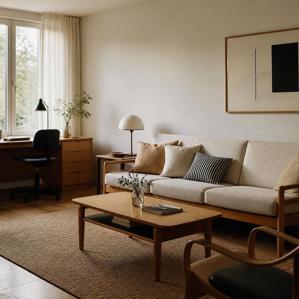
What to take from it
Place the desk from the light first and the wall second. In a small apartment that usually means the window on your short side, not straight ahead.
The separation between working and living was handled with thin partitions, sliding doors and curtains rather than structure. A curtain track costs a fraction of a divider and disappears when you do not need it.
Every material in that house is a real one. Wood, brick, stone and metal, with four brick hearths built into the plan.
Finn Juhl’s Study: A Small Room Built From the Inside Out
Finn Juhl built his own house outside Copenhagen in 1942, at thirty years old. He used an inheritance and whatever wartime Denmark had left. Images of the house are copyright, but here is a short video to catch the vibe.
It is an L-shaped bungalow. One arm holds a large living room and a small study. The other holds the kitchen, dining room and bedrooms.
The furniture came first
Juhl designed the house from the inside out. The furniture set the rooms, and the rooms set the facade.
That order is the opposite of how most people furnish. They take the room as given, then hunt for pieces that fit the leftover space.
The result reads as generous on a small footprint. That is the whole problem a small apartment presents.
Color used with nerve
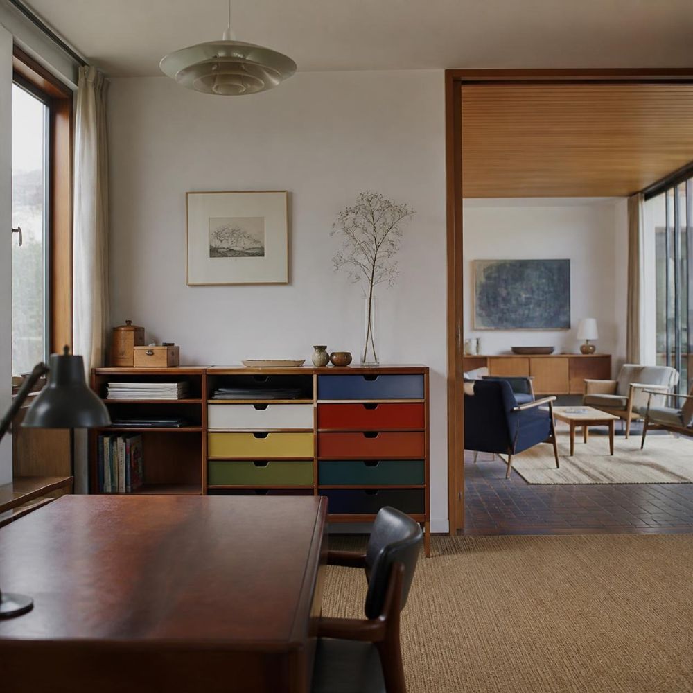
The interiors are not neutral. Strong wall colors sit behind sculptural furniture and art, and the effect is warm rather than loud.
People assume mid-century means beige and teak. The houses were braver than the reproductions, and a considered wall color is the cheapest thing on this list.
What to take from it
Choose three or four pieces for the work corner and design the corner around them. Then stop.
A room with four good things in it looks composed. The same room with twelve looks like storage, which is the argument I make in the small apartment ideas post.
Lina Bo Bardi’s Casa de Vidro: Materials That Became the Period
Lina Bo Bardi built the Casa de Vidro in São Paulo in 1951, as her own home. She designed the stair, the bookshelves and the door handles on the same logic as the building.
The slender metal elements and the transparency repeat everywhere. The interior is composed from the arrangement of furniture, objects and art rather than filled.
Ordinary materials used against type
Nothing she chose was exotic at the time. Linoleum, stainless steel, glazed ceramic, and a pale blue stone floor in the main room were all current, mass-produced surfaces.
Her curator makes the point plainly. The materials were in fashion, and she used them differently.
Seventy years later those combinations read as the signature of the era. That happens when a material is chosen for how it behaves rather than how it looks this season.
The view changed and the room still works
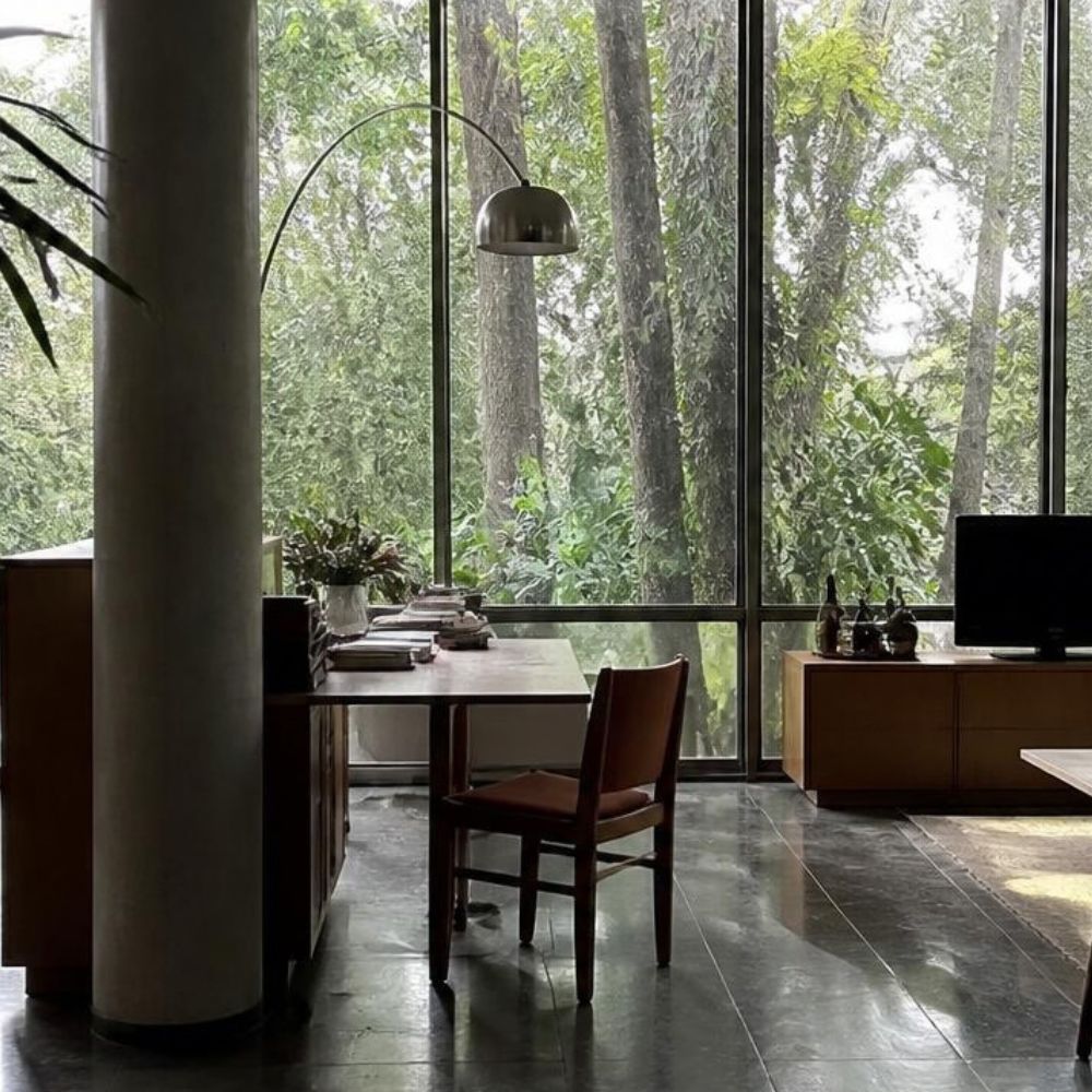
When the house was built it looked out over an open landscape. The forest has since grown in around it, and the glass now frames dense green on every side.
The atmosphere is completely different and the room is unharmed. A space built around light, proportion and honest surfaces survives the view changing.
What to take from it
Pick one surface material and repeat it. One wood for the desk and the storage, or one metal across the lamp, the legs and the handles.
Repetition is what makes a small room read as designed instead of assembled. The palette-building method works the same way for materials as it does for color.
Why the Shelves Are the Wrong Lesson
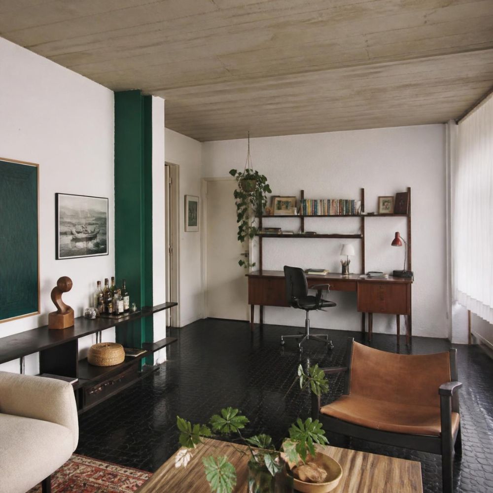
Search this style and the results are relentless. Home office corner wall shelves, wood wall-to-wall shelves, floating shelves libraries.
Those images are beautiful but they are teaching the wrong thing.
Where the idea came from
Mid-century houses were generally smaller than ours and held fewer objects. People still owned things, and they still had to put them somewhere.
Look at where the surviving images came from. Magazine shoots, manufacturer catalogs and the archives that Greenberg went through for her book.
A styled shelf photographs well and a closed cupboard does not. So the shelf is what got recorded, and the cupboard, holding everything the household actually used, stayed out of frame.
There is a second reason. Herman Miller and Knoll were selling into offices, where paperwork lived in closed cases by default, and nobody photographed those either.
Shelves are display, storage is something else
An open shelf shows you everything on it, all day, whether or not you want to see it. In a room where you also sleep or watch television, that is a second job nobody asked for.
Dust is the practical half of the argument. Visual noise is the other half, and both get worse in a small room.
Keep the shelf for books, one object and nothing else. Everything you use daily should live behind a door.
What replaces them
Three formats cover almost every small-space situation, and each one suits a different room.
| Type | What it holds | Choose when | Trade-off |
|---|---|---|---|
| Low credenza or sideboard | Files, cables, printer, everything ugly | The desk sits in a living room and the room has to convert | Takes 40–45 cm of floor depth [VERIFY: confirm against your usual spec] |
| Wall-hung closed cabinet | Stationery, chargers, the day’s paperwork | Floor area is gone and wall area is not | Needs solid fixing, and 35 cm depth is the practical maximum above a desk [VERIFY] |
| Built-in run with doors | Work, books and household storage together | You own the apartment and the wall is permanent | Costs the most and cannot move with you |
| One open shelf | Books and a single object | You genuinely want the room to show something | Requires editing every few weeks |
The living room storage guide covers what to hide, and how. The multifunctional furniture post covers making one piece earn its footprint.
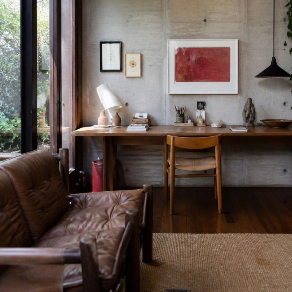
How to Build a Mid Century Modern Office on a Budget
None of these rooms were assembled from a catalog. Two were built during or just after a war.
Spend on the storage, save on everything else
The closed storage decides whether the room looks right. It sets the wood tone and holds a horizontal line below eye level.
Buy that one secondhand if you can, and stop worrying about solid wood. Almost every good Danish case piece from the period is teak or rosewood veneer over pine or plywood, with solid timber kept for the legs, handles and frames.
A vintage credenza costs less than a new reproduction and was built better.
- Spend: the credenza or cabinet, and the task lamp
- Save: the desk, which can be a plain wooden top on good legs
- Save: the chair, if you buy a secondhand task chair and skip the icon
- Skip: anything sold as a mid-century wide bookshelf to fill a wall
The three-material rule
One wood, one soft material, one metal. That is the whole formula, and it is the reason these rooms photograph so calmly.
Walnut and teak carry the period most clearly. Oak works and reads slightly cooler, which suits a north-facing room.
The materials of the period also included molded plywood, fiberglass and laminate. A laminate top is historically correct rather than a compromise.
The three things that cost nothing
Where the desk faces, what the lamp does, and what stays off the surface at the end of the day.
A task lamp with a visible shape marks the corner as a workspace while it is on. The lighting rules for small spaces explain the layering, and the living room office combo post covers orientation.
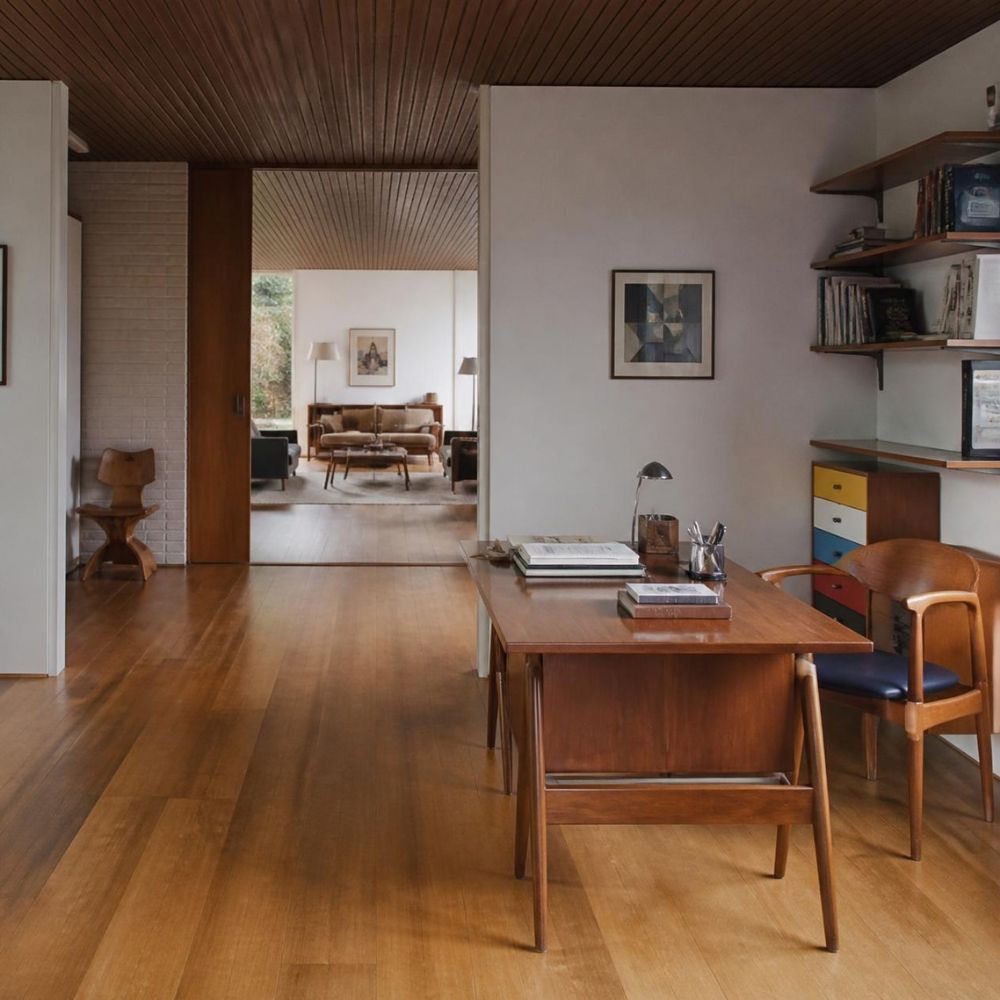
Final Thoughts
Four rooms, four different problems, and one shared method. Each was built around a small number of good things rather than filled with many.
Aalto placed the work at the light. Juhl designed the room from the furniture outward. Bo Bardi chose ordinary materials and repeated them until they became a signature.
Draper’s office supplies the storage rule, which is the one most people get backwards. Closed doors, one object out, and a plant where the skyline used to be.
That room is also the newest thing here by forty years. Everything worth copying in it was already old when the cameras arrived..
Tell me which of these rooms you would actually live in. Leave a comment below, or join the newsletter to follow the renovation diary and more posts on small-space living.
Frequently Asked Questions About a Mid Century Modern Office
What makes an office look mid century modern?
Warm wood, tapered legs, a low horizontal storage piece and one sculptural light. Restraint matters more than any single item.
What wood is used in mid century modern furniture?
Walnut is the defining American wood and teak the Scandinavian one. Rosewood appears on premium pieces, and oak is a good modern substitute for both.
Are floating shelves mid century modern?
Wall-hung storage suits the period, but the original rooms used closed cabinets far more than open shelves. Use a shelf for books and one object rather than for daily storage.
Can you do mid century modern in a small apartment?
The style was developed in small houses, so it fits better than most. Low furniture and visible legs make a small room read as more open.
What colors work in a mid century modern office?
Warm neutrals with olive, mustard, burnt orange or muted teal as accents. The period houses were braver with color than the reproductions suggest.
Do I need original mid century furniture?
No. Buy one secondhand piece with real material quality, then let plainer modern items fill in around it.
What desk shape is mid century modern?
A rectangle on four tapered legs, usually shallower than a modern desk. Check the depth against your screen, since many period pieces were built for paper.
Where does the mid century modern trend actually come from?
The furniture dates from roughly 1945 to 1965, but the name arrived in 1984 with Cara Greenberg’s book on postwar design. Collectors picked it up, Herman Miller and Knoll reissued the classics through the nineties, and Mad Men carried it to a general audience in 2007.
Read Next

For the wider furniture question, the architectural principles for small-space furniture can help you choose each piece for your small home.